Design Process of the Asset Summary View App
The Problem
CAR T-cell therapy is an emerging immunotherapy for lukemia, lymphoma, and other cancers. It involves harvesting T-cells from the patient, modifying them to destroy cancerous cells, multiplying the modified CAR T-cells in bioreactors, and then injecting them back into the patient for highly effective treatments customized to each individual. To read more about CAR T-cell therapy from the American Cancer Society click here. It is still in the early developmental phases but shows very promising results. When done right it has an estimated 90% cure rate. The catch is that the current manufacturing process is very expensive, at high risk of contamination, and requires near constant monitoring.
GE needs a digital solution to allow users to easily monitor bioreactors, reduce risk of contamination, and connect their bioreactors as well as third party machines to Predix, GE's analytic and predictive cloud platform.
Our Solution
We created a fully customizable dashboard to monitor multiple bioreactors in real time. Since the manufacturing process is still relatively new, scientists are constantly experimenting to further improve the process. This table allows users to quickly hide or show whatever data is most useful for their process as well as quickly alerting them to any potential problems which can be fatal.
Since the writing of this case study this project has been sold as part of the BioPharma sale to Danaher and now belongs to Cytiva.
The Team
For this project I worked directly under my UX manager Bill Williamson. Bill took the lead on UX research as well as managing me. We collaborated on the visual directions. I took the lead on developing the UI and visuals, wireframing, building clickable prototypes, communicating with and supporting the dev team during development, QA of UX, as well as a little bit of user testing and interviewing.
I also worked closely with a number of project managers including Bhumica Ghandhi, Gary Jensen, Andras Holczinger, and Shaw Li. There were also more than two dozen engineers, scientists, and technicians who I consulted or worked with on a regular basis. Without their hard work and commitment this project would not have been possible. The team spanned four countries and several time zones. I consider it a privilege to have the chance to work with such a deeply knowledgeable and diverse group on this project.
User Types and Preexisting Hardware
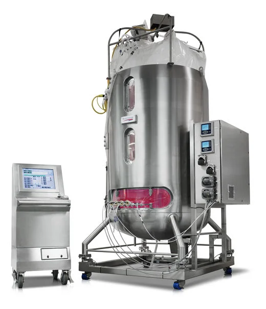
Xcellerex XDR single-use bioreactor systems provide scalable and robust stirred-tank performance for up to 2000 L in both cGMP and non-cGMP environments.
GE has long been known as an industrial company. In the digital age they are well positioned to transform themselves into an industrial internet of things company thanks to the large number of bioreactor machines that they have on the market. However, connecting these legacy machines to the cloud in a way that matches current medical safety standards is challenging.
User Personas
Scientist / Lab Technician - Has direct interaction with machines and/or treatments and would monitor individual bioreactors in the lab as well as be an expert in the biology and the cell therapy process.
Manager - Site managers would oversee all production at a site or lab as well as machine utilization, output, and personnel. Little to no direct interaction with machines or treatments.
Service Technician - GE employees or third party company that periodically does maintenance or repairs on machines.
The Asset Summary View table was mainly designed for daily use by the Manager and the Scientist / Lab Technician personas. The Manager persona would mostly be using this table to oversee the efficiency of machines and personnel. Scientist / Lab Technician persona would be more interested in using the table to produce and manage the cell therapy treatments. Occasionally a Service Technician may access the table to diagnose problems but they are not the primary user for this app.
Low Def to High Def Wireframes
Iterating the table
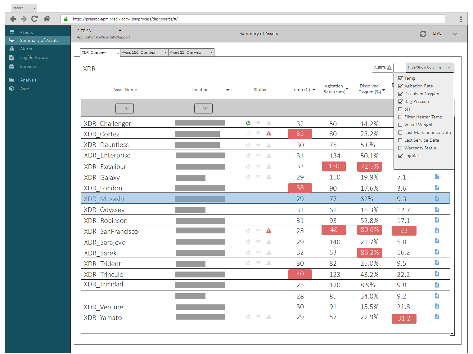
GE's cell therapy project has been under development in experimental phases for a couple of years. I came in a little ways into the beginning of the first version of the app. This screen on the left was the low def wireframe I received from my UX manager when I first began working on the project. It consists of a simple customizable table with a list of connected bioreactors. The table lists some stats for each bioreactor like location and statuses, alerts, connectivity, and if the machine is on or off. Key metrics such as temperature and dissolved oxygen levels are also listed to allow scientists to easily monitor the treatments on the machines for potential problems. A drop down menu allows users to show or hide the key metric columns that are most useful to them.
Below is the first iteration of the wireframes that I worked on when I joined this project.
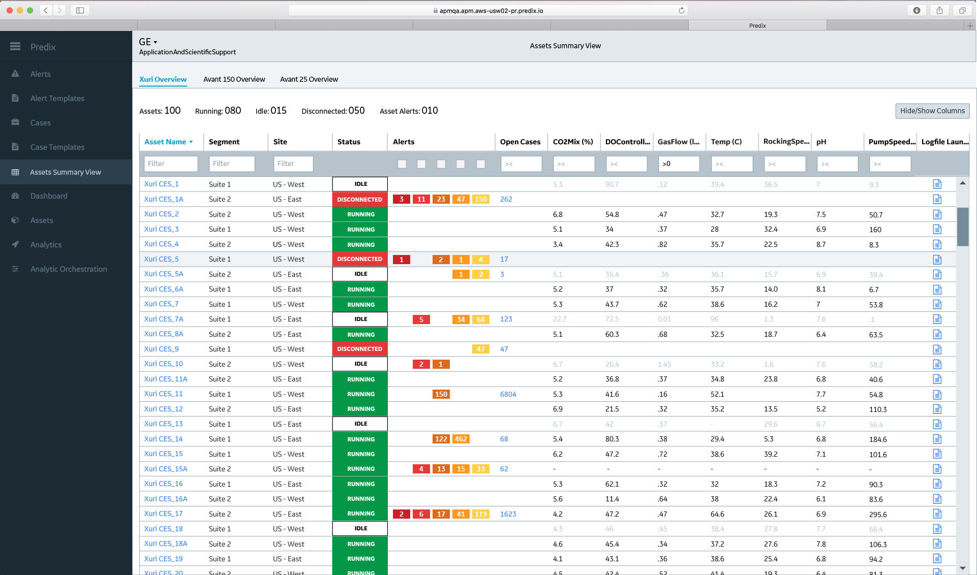
In my first iteration of the wireframes I translated it into a pixel perfect version in accordance with Predix's visual guidelines. I also added the addition of a table hover highlight to make it easier to quickly scan rows as well as filters at the top of each column. Depending on the content of the column, the filters were either alpha filters or numeric filters. The alerts icon was changed into a counter. For the Scientist / Lab Technician persona the alerts are one of the most important components on the table except for the status which will be covered in more detail shortly. An alert is the Scientist / Lab Technician's first indication that something has gone wrong. When manufacturing cell therapy treatments the stakes are high. The patient only gets one chance at an effective treatment and failure likely means death. In one interview a scientist said that he thought a scientist who let a sample die should be punished with jail time.
Hide/Show Option 1: Grouping tags into expandable categories
Hide/Show Option 2: Adding a search bar and separate sections to hide or show columns.
In the next iterations we experimented with Hide/Show drop down menus. One of the challenges was that there are over 300 different columns that the users can choose to display. We needed to find a way to effectively organize 300 columns so that users could find, as well as hide and show, the columns they were looking for. Grouping tags into expandable categories was an early option but it was not very efficient in user testing.
A second option was to include a search bar and split the drop down into two sections. The top section was for adding columns and the bottom section was for hiding columns currently being shown on the table.
In the final iteration we also broke off the drop down menu into a separate dialogue box since a drop down menu was too cramped.
The final flow for the Hide/Show Columns is detailed below in the following two slides which acted as part of the final deliverables for the dev team.
Column Counter - Dealing with Technical Restrictions
Rarely is the creation process a smooth one. This project had it's own share of last minute additions that we had to accommodate by integrating the new changes in a coherent manner with the rest of the app. The image below details the addition of the Column Counter and it’s behavior flow.
Late in the development process we were informed by the development team that the table only had the capacity to support 40 columns at a time. This is more than enough for any single user but there is a high likelihood that users will come up against a case where they try to add more than 40 columns simply because they do not bother to hide them. We needed a way to let users know that they were approaching or had exceeded the 40 column limit. I came up with a column counter which I added to the bottom section as an addition to the Hide/Show flow.
Machine Connectivity Status - Fine Tuning for Users Needs
The connectivity and on/off icons of the original low def wireframes were also upgraded to text statuses detailing running, idle, or disconnected states. This was because we quickly realized from user feedback that the statuses were too complex to be communicated with binary icons. The wifi icon also caused a lot of confusion around whether the machine was connected to the wifi when really it was meant to communicate whether or not there was a “heartbeat”. The “heartbeat” is the connection between the bioreactor and the software running the method on the bioreactors.
We also began getting feedback from some of our Manager and Scientist / Lab Technician users that a binary on/off icon was not an accurate icon to use in the context of bioreactors. Users will often leave the bioreactors on for long periods of time. It is much more useful for them to know if a bioreactor is running a method ( in the process of manufacturing a cell therapy treatment), idle (finished running a method), or disconnected ( no heartbeat and thus unable to tell if bioreactor is running or idle and therefore possibly in the middle of running a method in which case a treatment was in danger of being lost ). From this we created the three statuses Running, Idle, and Disconnected depicted above. The Running status means the machine is in the middle of running a method while Idle means the machine has finished running a method. Running and Idle both depend on the presence of a “heartbeat”. Without a “heartbeat” it is not possible to tell if the machine is running a method and the status changes to Disconnected.
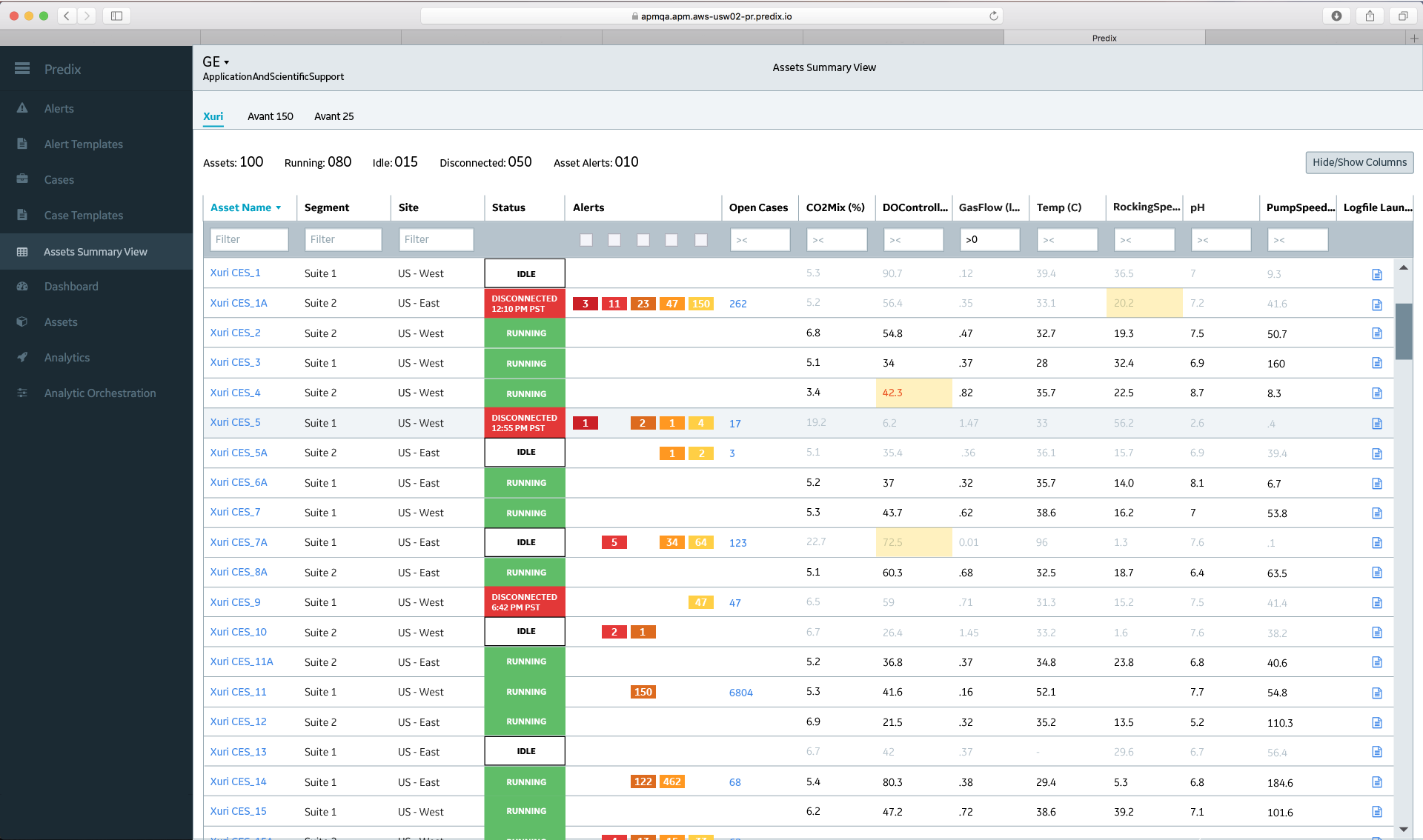
Additionally the KPI text in the rows with a Idle or Disconnected status will become gray to let users know that these are the last known data readings but that they may be out of date.
This change to the Status column was well received by users as it more closely aligned to their production methods and their thought process.
Keeping Accessibility in Mind
In later iterations we adjusted the Status column to be more accessible for color blindness. The green and red of the running and disconnected statuses in particular are easy to confuse for people with certain vision issues. To make the status more accessible we decided to make the green running status a lighter shade of green. This would also have the additional affect of making the red disconnected status stand out more which was a plus for users. Users want to see possible errors as soon as possible. An update that would add a timestamp on a disconnected status was also planned.
Machine Alerts - All Five Severity Levels
The alerts column also went through another iteration. Previously the alerts were treated as a single counter but this is very misleading since there are actually five different severity of alerts. It’s common to have a lot of lower severity alerts which are usually nonthreatening to the cell sample. While these are not very concerning to our users a high level severity 1 or 2 alert could mean the imminent loss of a sample and the possible death of the patient. After some consideration we redesigned the alerts column to display severity using a preexisting color scheme from a different alerts app on the platform and by standardizing the positions of the alert severities in the column.
This update to the alerts’ severity was very well received by users in testing as it helped them to respond to problems quickly or prioritize which problems to handle first in the case of multiple crises.
In order to allow users to filter the table by alerts we added five check boxes, one for each severity to give users flexibility over which alerts they would like to filter for. Clicking on one of the alert badges will bring the user to the Alerts app for that specific bioreactor and gives more details on the alert.
To help keep the table space efficient and decrease the mental load on users we added a tooltip that spells out number and type of severity. In user testing we uncovered that the lower severity alerts could number into the hundreds. Since space efficiency was a priority the tooltip was also useful when letting the users know how many alerts there were if the counter ever went over 3 digits.
Persistent Data - More Machines Than Screen
As GE obtained customers with more machines to monitor, these users brought up an interesting use case. In a scenario where there were more than 19 or 20 machines users would not be able to monitor all of them without scrolling. Manager personas were particularly concerned about this since they are likely to be monitoring a whole factory or floor. To help managers be more aware of machines that might be out of view we added the Persist Data text above the table which gives a count of the total number of assets on that tab, the count of each type of status, and the total number of Asset Alerts. This would allow Manager users to see at a glance if there were non-visible machines that might need immediate attention.
When KPIs Go Out of Range - Cell Highlighting
Throughout this process the Scientist / Lab Technician users’ need to react quickly to potential problems has been prioritized since failure to act in a timely manner could be fatal. As an additional way to quickly raise potential problems to users and relieve them of some of the mental burden we designed and implemented a cell highlighting feature that can be seen above. This feature would only highlight cells if the number for that KPI went out of the expected range. In this way the table could more quickly escalate potential problems to users before it becomes fatal. Additionally the text in a highlighted cell would only change to red if the status for that machine was Running. This is because it is very possible for KPIs to go out of range if the machine is disconnected or idle but it is less of a priority than a running machine with KPIs out of range.
Next Steps
At this point in the process the sale of GE Life Sciences to Danaher went into effect. Since this project was part of that sale the team transitioned to other projects. If we were to continue iterating on this project these are what my next steps would be:
Create user testing plan to uncover how the cell therapy process would change now that users have an easy way to monitor bioreactors.
Further user test Asset Summary View table especially for alerts filtering and accessibility.
Begin development of mobile versions of the app. Right now the Asset Summary View can be seen on mobile even though it was primarily designed for desktop.
One of the user asks was to increase update time of the table from 4 seconds to 2. This is something that would have to be developed in the backend but would add a lot of value to users.
Another popular user ask was to update the app to allow them to make adjustments to the treatments remotely in addition to remotely monitoring them. This long term goal would require a major overhaul of the app as well as the bioreactors but would be incredibly valuable in the fight against cancer.


